 Algeria Agency
Artificial intelligence
AI dashboards: know which advertising brings you customers
Advertising, shop and till on one screen: what brings you customers, what costs for nothing — and no conclusion without enough data.
What you can try for yourself
A demonstration
Three tools, one month, and a dashboard that refuses to conclude.
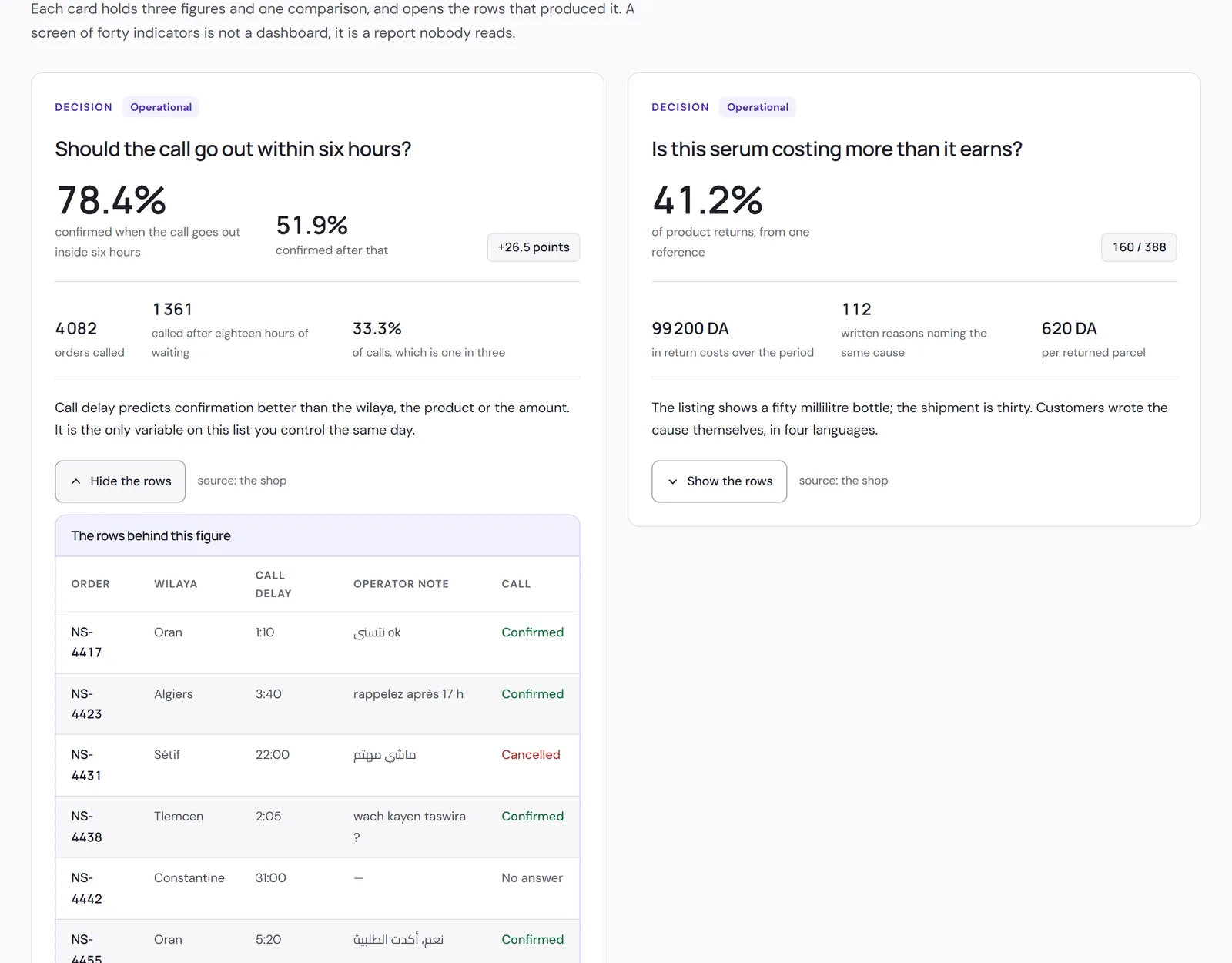
An imaginary online shop, twelve weeks of its orders, and the dashboard that reads them. Three tools give three figures for the same month: the demonstration reconciles them in front of you, produces four decisions, sets two aside for a human, and refuses to draw a forecast from any of it.
See the demonstrationThe shop does not exist and the figures are made up. What is real is how they are handled — including the two refusals, which are the part an ordinary dashboard never shows you.
What did each customer cost you last month, and through which channel did they arrive? If answering means opening four tools that give four numbers, the problem is not a shortage of data. A useful dashboard therefore starts by reconciling the sources and saying, when they contradict each other, which one governs and why.
We build these around a decision question rather than an inventory of metrics. "Should we raise the budget on this product", "which orders will cause trouble this week", "where does the ad spend that returns nothing go" — each translates into three or four numbers and a comparison. A screen of forty indicators is not a dashboard, it is a report nobody reads.
The predictive part is where we are most cautious. A forecast is a claim about the future built from a past that was under no obligation to repeat itself, and it is worth nothing without its uncertainty. So we show a range and the number of observations behind it, and we refuse to show a forecast when the history is too short — which, for many businesses, is the case in year one.
That last point is the only one that really matters. A dashboard that says "not enough data to conclude" is more useful than one giving a confident number drawn from eleven observations, because the confident one will be believed and used to decide.
What we usually find
- Your ad tools, your shop and your accounts give three different figures for the same month.
- You open five interfaces to answer one question, so you stop asking it.
- Your reports arrive too late to change anything about the decision they concern.
- You were promised forecasts off a few weeks of history, and you rightly distrust them.
What changes
A declared source of truth
For each figure, which tool governs and why the others differ. That deliverable ends the meeting argument about which number is right.
One screen per decision
Three or four numbers and a comparison, fitting on a phone. A dashboard only readable on a desktop is a dashboard nobody reads.
An explicit refusal when it is too early
The forecast only appears if the history supports it, and shows its range when it does. Silence is a result.
What you get
Reconciling your sources
Advertising, shop, till and accounting brought together with the matching rules written down. Residual gaps are shown, not smoothed away.
Plain-language querying
A question asked in one sentence returns the figure and how it was calculated, so the answer can be checked.
Alerts on deviation, not on thresholds
The signal fires when a value leaves its usual behaviour, not when it crosses a round number somebody picked a year ago.
Forecasts carrying their uncertainty
A range, the number of observations, and the last recalculation date. A single point with no interval is an opinion presented as a fact.
Built for a phone screen
Real consultation happens standing up, between two meetings. A dashboard designed for a large screen is one consulted once a month.
Export and a way out
The data stays exportable in an ordinary format. A dashboard must not become the place your numbers are held hostage.
How we work
The three questions
We ask for the three decisions you make regularly without adequate data. Everything else in the project follows from them.
Auditing the sources and the gaps
We compare what your tools say about one period and document why they differ. That page is often the first genuinely useful deliverable.
One screen, live
The first dashboard answers a single question and goes to production. The rest come after use, not before it.
Usage review at one month
What gets read stays, what does not is removed. An unread screen costs maintenance and dilutes attention.
Is this the right fit for you?
This is for you if
- You have several data sources that contradict each other over the same periods.
- A recurring decision waits on a figure nobody produces in time.
- Somebody internally will look at the screen weekly — otherwise there is no point.
This is not for you if
- Your data is entered irregularly and nobody is willing to fix that.
- You want forecasts off a few weeks of history.
- The real goal is producing a report for a third party rather than deciding anything.
What we commit to
No forecast without its uncertainty
A range and the volume of data behind it, always. If the history is insufficient, the screen says so instead of showing a confident number.
Gaps between sources are shown
We do not pick the most flattering figure to make the tools agree. When two sources diverge, both are displayed.
Your data stays exportable
At any time, in a format readable without us. We do not build a dependency that would make changing supplier expensive.
What changes for an Algerian business
A significant share of revenue happens offline and in cash, which makes attribution partly impossible. A campaign can produce a shop visit that no tool connects back to it. We would rather build a dashboard that declares that hole than an attribution model that fills it with an invisible assumption.
Local seasonality does not follow the foreign patterns baked into these tools. Ramadan, the start of the school year, holiday periods and the summer break move demand in ways a model trained elsewhere reads as an anomaly. A history covering at least one full cycle is what makes a forecast honest here.
Broken series are common: a change of tracking provider, a rebuilt shop, a recreated ad account. Those breaks are marked explicitly on the charts, because a curve restarting from zero with no explanation reads as a commercial collapse.
Frequently asked questions
How much history does a forecast need?
It depends on your seasonality, but less than one full cycle almost never suffices. We say so beforehand, and the screen repeats it afterwards.
Can you connect our advertising to our in-store sales?
Partly, and honestly. We show what is measurable and mark what is not, rather than filling the gap with an estimate.
Do we need to change our tracking tools?
Rarely. We work with what you already have; a change is only proposed if the current tool produces no usable data.
Who updates the dashboards?
They update themselves. What needs a human is the monthly check on the gaps between sources, and that check is written down.
What if we do not like the numbers?
They stay on screen. We do not build a display whose function is reassurance; that is the only way it stays useful for deciding.
How long for the first screen?
A few weeks, much of it on the source audit — the stage everyone wants to skip and the one that determines everything else.
How to start
Write to us and note the three decisions you make each month without the right figure — for example, where to put the advertising budget.
We tell you which of them your data can genuinely inform, and which it cannot.
Let’s find where your next customers will come from
Tell us where things stand — your ads, your website, your Google listing — and what you are after. We reply within one working day, and the conversation commits you to nothing.
- No forecast without its uncertainty
- Gaps between sources are shown
- Your data stays exportable